March 21st, 2016 • 1 Comment
Orchestration and Scheduling are not the newest topics, in fact they have been used in distributed systems forever (as in a couple of decades :-)). Systems like Mesos and Kubernetes (or offerings like Mantl) have brought advancements when it comes to dealing with scale. Other systems have a great background in scheduling and offer many (read a whole lot) policies for the same, this includes technologies like Grid Engine, LSF/OpenLava, etc.. Actually some of these technologies integrate with each other (like navops, Kubernetes and Mesos, OpenLava and Mesos, …), which makes it for example interesting when dealing with scheduling for space & order at the same time.
Next to pure demand, upcoming trends like CNCF & OCI as well as the introduction of Software Defined Infrastructure (SDI) drive the number of resources and services the Orchestrators and Controllers manage up. And the Question arises how to efficiently manage your data center – doing it by a human pressing a button is just not going to scale 🙂
Feedback control systems are a great start, however have some drawbacks. The larger the scale the more conflicts you might get between the feedback loops. The approaches might work up to rack level but probably not much beyond that. For large scale we need an approach which works along the lines of watch (e.g. by using snap), learn/decide (e.g. by using TAP) and act (See Jason Waxman’s keynote at OCP). This will eventually allow for a operatorless/humanless/driverless operations of the data center to support autonomous operations for scaling, healing and optimizing e.g. TCO.
Within Intel Labs we have therefore come up with the concept of a foreground and a background flow. Within a continuously running background flow we observe (if needed over long time-periods) the data center with its resources and services and try to derive & update models heuristics (read: rule of thumb) continuously using analytics/machine learning. Within a foreground flow – which sometimes is denoted the fast loop as it needs to perform – we can than score against those heuristics/models in actions plans/recipes.
The action plan/recipes describe a process on how we deal with a initial placement or re-balancing event. The scoring will allow for making better initial placement (adding a workload) as well as re-balancing decisions (how/what/when to kill, migrate or tune the infrastructure). How to derive an heuristics is explained in a paper referenced below – the example within that is about to learn how to best place a VNF so that is makes optimal use of platform features such as SR-IOV. Multiple other heuristics can easily be imagined, like learning how many cores a certain workload needs.
The following diagram shows the background and foreground flow.
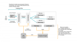
(Click to enlarge)
The heuristics are stored in an Information Core which based on the environment it is deployed in tunes itself. We’ve defined the concepts described here in a paper submitted to the Middleware 2015 conference. The researchers from Umea (who also run this highly recommended workshop) have used it and demonstrate an example use case in the same paper. For an example on how a background flow can help informing the foreground flow read this short paper. (Excuses for the paywall :-))
I’ll follow-up with some more blog posts detailing certain aspects of our latest work/research, like how the landscape works.
Categories: Work • Tags: Analytics, Cloud, data center, Machine Learning, Orchestration, Scheduling, SDI • Permalink for this article
January 2nd, 2016 • Comments Off on Graph stitching
Graph stitching describes a way to merge two graphs by adding relationships/edges between them. To determine which edges to add, a notion of node types is used (based on node naming would be easy :-)). Nodes with a certain type can be “stitched” to a node with a certain other type. As multiple mappings are possible, multiple result/candidate graphs are possible. A good stitch is defined by:
- all new relationships are satisfied,
- the resulting graph is stable and none of the existing nodes (entities) are impacted by the requested once.
So based on node types two graphs are stitched together, and than a set of candidate result graphs will be validated, to especially satisfy the second bullet.
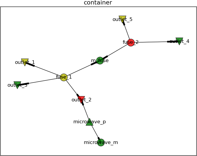
Let’s use an example to explain this concept a bit further. Assume the electrical “grid” in a house can be described by a graph with nodes like the power outlets and fuses, as well as edges describe the wiring. Some home appliances might be in place and connected to this graph as well. Hence a set of nodes describing for example a microwave (the power supply & magnetron), are in this graph as well. The edge between the power supply and the power outlet describe the power cable. The edge between the power supply and the magnetron is the internal cabling within the microwave. This graph can be seen in the following diagram.

(Click on enlarge)
The main fuse is connected to the fuses 1 & 2. Fuse 1 has three connected power outlets, of which outlet #2 is used by the microwave. Fuse 2 has two connected power outlets. Let’s call this graph the container from now on.
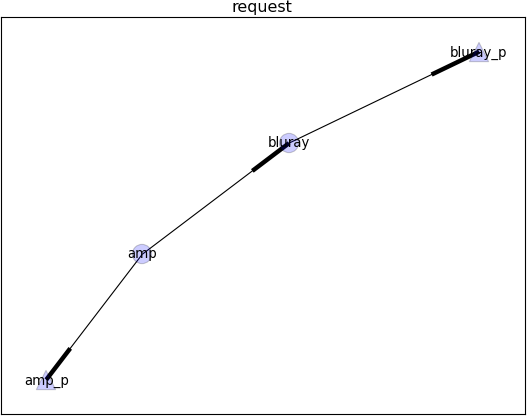
Now let’s assume a new HiFi installation (consisting of a blu-ray player and an amplifier) needs to be placed within this existing container. The installation itself can again be described using a simple graph, as shown in the following diagram.

(Click to enlarge)
Placing this request graph into the container graph now only requires that the power supplies of the player and amplifier are connected to the power outlets in the wall using a power cord. Hence edges/relationships are added to the container to stitch it to the request. This is done using the following mapping defition (The power_supply and power_outlet are values for the attribute “type” in the request & container graph):
{
    "power_supply": "power_outlet"
}
As there is more than one possible results for stitching two graphs, candidates (there are 2 power supplies and 5 power outlets in the mix) need to be examined to see if they make sense (e.g. the fuse to which the microwave is connected might blow up if another “consumer” is added). But before getting to the validation, the number of candidates graphs should be limited using conditions.
For example the HiFi installation should be placed in the living room and not the kitchen. Hence a condition as follows (The power outlet nodes in the container graph have an attribute which is either set to ‘kitchen’ or ‘living’) can be defined:
condition = {
    'attributes': [
        ('eq', ('bluray_p', ('room', 'living'))),
        ('eq', ('amp_p', ('room', 'living'))),
    ]
}
Also the amplifier should not be placed in the kitchen while the blu-ray player is placed in the living room. Hence the four nodes describing the request should share the same value for the room attribute. Also it can be defined that the power supplies of the player & amplifier should not be connected to the same power outlet:
condition = {
    'compositions': [
        ('share', ('room', ['amp', 'amp_p', 'bluray', 'bluray_p'])),
        ('diff', ('amp_p', 'bluray_p'))
    ]
}
This already limits the number of candidate resulting graphs which need to validated further. During validation it is determined if a graph resulting out of a possible stitching falls under the definition of a good stitch (see earlier on). Within the container – shown early – the nodes are ranked – red indicating the power outlet or fuse heavy loaded; while green means the power outlet/fuse is doing fine. Now let’s assume no more “consumers” should be added to the second outlet connected to the first fuse as the load (rank) is to high. The high load might be caused by the microwave.
All possible candidate graphs (given the second condition described earlier) are shown in the following diagram. The titles of the graphs describe the outcome of the validation, indicating that adding any more consumers to outlet_2 will cause problems:

(Click to enlarge)
The container and request are represented as shown earlier, while the stitches for each candidate resulting graph are shown as dotted lines.
Graph stitcher is a simple tool implements a simple a stitching algorithm which generates the possible graphs (while adhering all kinds of conditions). These graphs can than be validated further based on different validators. For example by looking at number of incoming edges, node rank like described before, or any other algorithm. The tool hence can be seen as a simple framework (with basic visualisation support) to validate the concepts & usefulness of graph stitching.
Categories: Personal • Tags: Graph Stitching, Python • Permalink for this article
October 30th, 2014 • Comments Off on American Football Game Analysis
I’ve been coaching American Football for a while now and it is a blast standing on the sideline during game day. The not so “funny” part of coaching however – especially as Defense Coordinator – is the endless hours spend on making up stats of the offensive strategy of the opponent. Time to save some time and let the computer do the work.
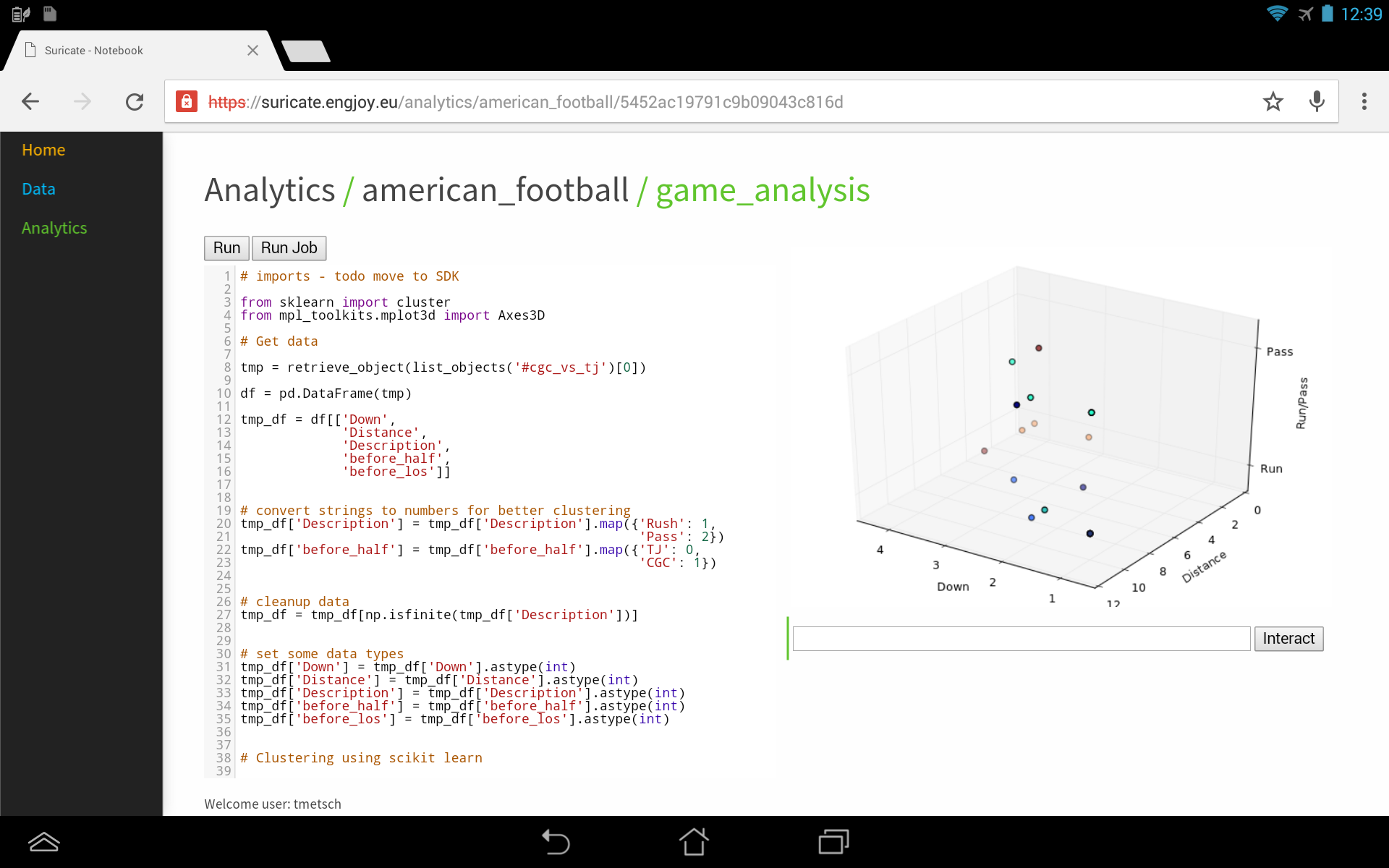
I’ve posted about how you could use suricate in a sports data setup past. The following screen shot show the first baby steps (On purpose not the latest and greatest – sry 🙂 ) of analyzing game data using suricate with python pandas and scikit-learn for some clustering. The 3D plot shows Down & Distance vs Run/Pass plays. This is just raw data coming from e.g. here.
The colors of the dots actually have a meaning in such that they represent a clustering of many past plays. The clustering is done not only on Down & Distance but also on factors like field position etc. So a cluster can be seen as a group of plays with similar characteristics for now. These clusters can later be used to identify a upcoming play which is in a similar cluster.
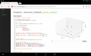
(Click to enlarge)
The output of this python script stores processed data back to the object store of suricate.
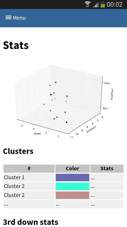
One of the new features of suricate is template-able dashboards (not shown in past screenshot). Which basically means you can create custom dashboards with fancy graphics (choose you poison: D3, matplotlib, etc):

(Click to enlarge)
Again some data is left out for simplicity & secrecy 🙂
Making use of the stats
One part is understanding the stats as created in the first part. Secondly acting upon it is more important. With Tablets taking on sidelines, it is time to do the same & take the stats with you on game day. I have a simple web app sitting around in which current ball position is entered and some basic stats are shown.
This little web application does two things:
- Send a AMQP msg with the last play information to a RabbitMQ broker. Based on this new message new stats are calculated and stored back to the game data. This works thanks to suricate’s streaming support.
- Trigger suricate to re-calculate the changes of Run-vs-Pass in an upcoming play.
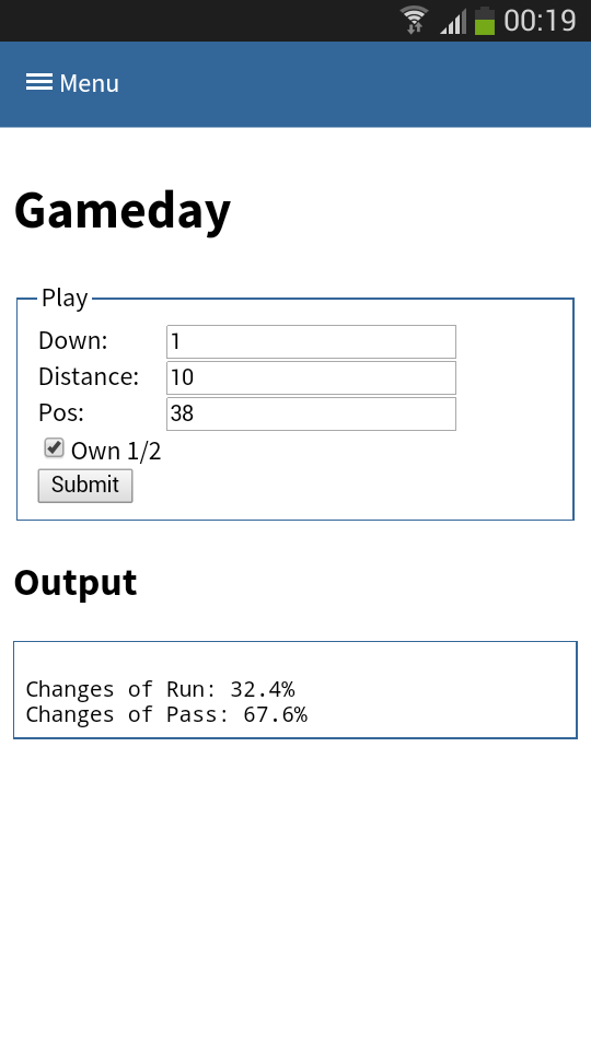
The webapp is a simple WSGI python application – still the hard work is carried out by suricate. Nevertheless the screenshot below shows the basic concept:

(Click to enlarge)
Categories: Personal, Sports • Tags: American Football, Data Science, Machine Learning, Python • Permalink for this article
September 21st, 2014 • 1 Comment
Suricate is an open source Data Science platform. As it is architected to be a native-cloud app, it is composed into multiple parts:
- a web frontend (which can be load-balanced)
- execution nodes which actually perform the data science tasks for the user (for now each user must have at least one exec node assigned)
- a mongo database for storage (which can be clustered for HA)
- a RabbitMQ messaging system (which can be clustered for HA)
Up till now each part was running in a SmartOS zone in my test setup or run with Openhift Gears. But I wanted to give CoreOS a shot and slowly get into using things like Kubernetes. This tutorial hence will guide through creating: the Docker image needed, the deployment of RabbitMQ & MongoDB as well as deployment of the services of Suricate itself on top of a CoreOS cluster. We’ll use suricate as an example case here – it is also the general instructions to running distributed python apps on CoreOS.
Step 0) Get a CoreOS cluster up & running
Best done using VagrantUp and this repository.
Step 1) Creating a docker image with the python app embedded
Initially we need to create a docker image which embeds the Python application itself. Therefore we will create a image based on Ubuntu and install the necessary requirements. To get started create a new directory – within initialize a git repository. Once done we’ll embed the python code we want to run using a git submodule.
$ git init
$ git submodule add https://github.com/engjoy/suricate.git
Now we’ll create a little directory called misc and dump the python scripts in it which execute the frontend and execution node of suricate. The requirements.txt file is a pip requirements file.
$ ls -ltr misc/
total 12
-rw-r--r-- 1 core core 20 Sep 21 11:53 requirements.txt
-rw-r--r-- 1 core core 737 Sep 21 12:21 frontend.py
-rw-r--r-- 1 core core 764 Sep 21 12:29 execnode.py
Now it is down to creating a Dockerfile which will install the requirements and make sure the suricate application is deployed:
$ cat Dockerfile
FROM ubuntu
MAINTAINER engjoy UG (haftungsbeschraenkt)

# apt-get stuff
RUN echo "deb http://archive.ubuntu.com/ubuntu/ trusty main universe" >> /etc/apt/sources.list
RUN apt-get update
RUN apt-get install -y tar build-essential
RUN apt-get install -y python python-dev python-distribute python-pip

# deploy suricate
ADD /misc /misc
ADD /suricate /suricate

RUN pip install -r /misc/requirements.txt

RUN cd suricate && python setup.py install && cd ..
Now all there is left to do is to build the image:
$ docker build -t docker/suricate .
Now we have a docker image we can use for both the frontend and execution nodes of suricate. When starting the docker container we will just make sure to start the right executable.
Note.: Once done publish all on DockerHub – that’ll make live easy for you in future.
Step 2) Getting RabbitMQ and MongoDB up & running as units
Before getting suricate up and running we need a RabbitMq broker and a Mongo database. These are just dependencies for our app – your app might need a different set of services. Download the docker images first:
$ docker pull tutum/rabbitmq
$ docker pull dockerfile/mongodb
Now we will need to define the RabbitMQ service as a CoreOS unit in a file call rabbitmq.service:
$ cat rabbitmq.service
[Unit]
Description=RabbitMQ server
After=docker.service
Requires=docker.service
After=etcd.service
Requires=etcd.service

[Service]
ExecStartPre=/bin/sh -c "/usr/bin/docker rm -f rabbitmq > /dev/null ; true"
ExecStart=/usr/bin/docker run -p 5672:5672 -p 15672:15672 -e RABBITMQ_PASS=secret --name rabbitmq tutum/rabbitmq
ExecStop=/usr/bin/docker stop rabbitmq
ExecStopPost=/usr/bin/docker rm -f rabbitmq
Now in CoreOS we can use fleet to start the rabbitmq service:
$ fleetctl start rabbitmq.service
$ fleetctl list-units
UNIT                    MACHINE                         ACTIVE  SUB
rabbitmq.service        b9239746.../172.17.8.101        active  running
The CoreOS cluster will make sure the docker container is launched and RabbitMQ is up & running. More on fleet & scheduling can be found here.
This steps needs to be repeated for the MongoDB service. But afterall it is just a change of the Exec* scripts above (Mind the port setups!). Once done MongoDB and RabbitMQ will happily run:
$ fleetctl list-units
UNIT                    MACHINE                         ACTIVE  SUB
mongo.service           b9239746.../172.17.8.101        active  running
rabbitmq.service        b9239746.../172.17.8.101        active  running
Step 3) Run frontend and execution nodes of suricate.
Now it is time to bring up the python application. As we have defined a docker image called engjoy/suricate in step 1 we just need to define the units for CoreOS fleet again. For the frontend we create:
$ cat frontend.service
[Unit]
Description=Exec node server
After=docker.service
Requires=docker.service
After=etcd.service
Requires=etcd.service

[Service]
ExecStartPre=/bin/sh -c "/usr/bin/docker rm -f suricate > /dev/null ; true"
ExecStart=/usr/bin/docker run -p 8888:8888 --name suricate -e MONGO_URI=<change uri> -e RABBITMQ_URI=<change uri> engjoy/suricate python /misc/frontend.py
ExecStop=/usr/bin/docker stop suricate
ExecStopPost=/usr/bin/docker rm -f suricate
As you can see it will use the engjoy/suricate image from above and just run the python command. The frontend is now up & running. The same steps need to be repeated for the execution node. As we run at least one execution node per tenant we’ll get multiple units for now. After bringing up multiple execution nodes and the frontend the list of units looks like:
$ fleetctl list-units
UNIT                    MACHINE                         ACTIVE  SUB
exec_node_user1.service b9239746.../172.17.8.101        active  running
exec_node_user2.service b9239746.../172.17.8.101        active  running
frontend.service        b9239746.../172.17.8.101        active  running
mongo.service           b9239746.../172.17.8.101        active  running
rabbitmq.service        b9239746.../172.17.8.101        active  running
[...]
Now your distributed Python app is happily running on a CoreOS cluster.
Some notes
- Container building can be repeated without the need to destroy: docker build -t engjoy/suricate .
- Getting the log output of container to check why the python app crashed: docker logs <container name>
- Sometimes it is handy to test the docker run command before defining the unit files in CoreOS
- Mongo storage should be shared – do this by adding the following to the docker run command: -v <db-dir>:/data/db
- fleetctl destroy <unit> and list-units are you’re friends 🙂
- The files above with simplified scheduling & authentication examples can be found here.
Categories: Personal • Tags: Analytics, Cloud, CoreOS, Data Science, Python, Software Engineering, Tech • Permalink for this article
December 23rd, 2013 • Comments Off on Live football game analysis
Note: I’m talking about American Football here 🙂
In previous posts I already showed how game statistics can be used to automatically which Wide receiver is the Qb’s favorite on which play, down and field position. Now let’s take this one step further and create a little system (using Suricate) which will make suggestions to a Defense Coordinator.
The following diagram will guide through the steps needed to create such a system:
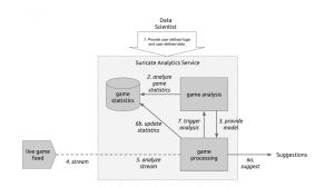
Live game breakdown (Click to enlarge)
Let’s start at the top. (Step 1) The User of Suricate will start with performing some simple steps. First a bunch of game statistics are uploaded (same as using in this post). Next also a stream is defined. In this case a URI for an AMQP broker (using CloudAMQP – RabbitMQ as a Service) is defined in the service. With this used defined data is provide to the service.
(Step 2) Now we start creating an analytics notebook. Suricate provides an interactive python console via your web browser which can easily be used to explore the data previously uploaded. Python Pandas and scikit-learn are both available within the Suricate service and can be used right away to accomplish this task:
Exploring game statistics (Click to enlarge)
Based on the data we can create a model which describes on which down, on which fieldposition a run or a pass play is performed. We can also store who is the favorite Wide receiver/Running back for those plays (see also). All this information is stored in a JSON data structure and saved using the SDK of Suricate (Step 3).
(Step 4) Now a little external python script needs to be written which grabs relatively ‘live’ game data from e.g. here. This script now simple continuously sends messages to the previously defined RabbitMQ broker. The messages contain the current play, fieldposition and distance togo information.
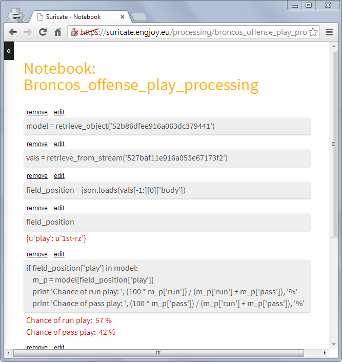
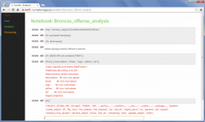
(Step 5) Now a processing python notebook needs to be written. This is a rather simple python script. It takes the new incoming messages and compares them to the model learned in step 2 & 3. Based on that suggestions can be displayed (Step 6a) – “e.g. watch out for Wes Welker on 3rd and long at own 20y line” or just some percentages for pass or run plays:

Processing notebook (Click to enlarge)
Next the information about the new play can be added to the game statics data file (Step 6b). Once this is done a new model can be created (Step 7) to get the most up to date models all the time.
With this overall system new incoming data is streamed in (continuous analytics), models updated and suggestions for a Defense Coordinator outputted. Disclaimer: some steps describe here are not yet in the github repository of suricate – most namely the continuously running of scripts.
Categories: Personal, Sports • Tags: American Football, Analytics, Data Science, Machine Learning • Permalink for this article